Content Distribution on Quora
As part of efforts to promote content distribution, I worked on several projects that increased engagement across Quora feeds.
My Role
I was a product design intern on the Quora distribution team where I collaborated with engineers, ML engineers, data scientists, and designers on feed-related projects. I designed, built and ran A/B tests for each feature I worked on, ensuring a balance between experience and metrics.
Output
- Mockups
- A/B Tests
- UI components
Duration
2021
(4 months)
Context
Quora is a Q&A platform dedicated to sharing and growing the world’s knowledge. Beyond answering questions, users can build communities around specific topics using features like Quora Spaces.
Challenge
We wanted to help Quora Space Owners grow their communities by improving content distribution and engagement.
Spaces Question & Answers
I implemented changes that increased the number of questions asked and answered in Quora Spaces.
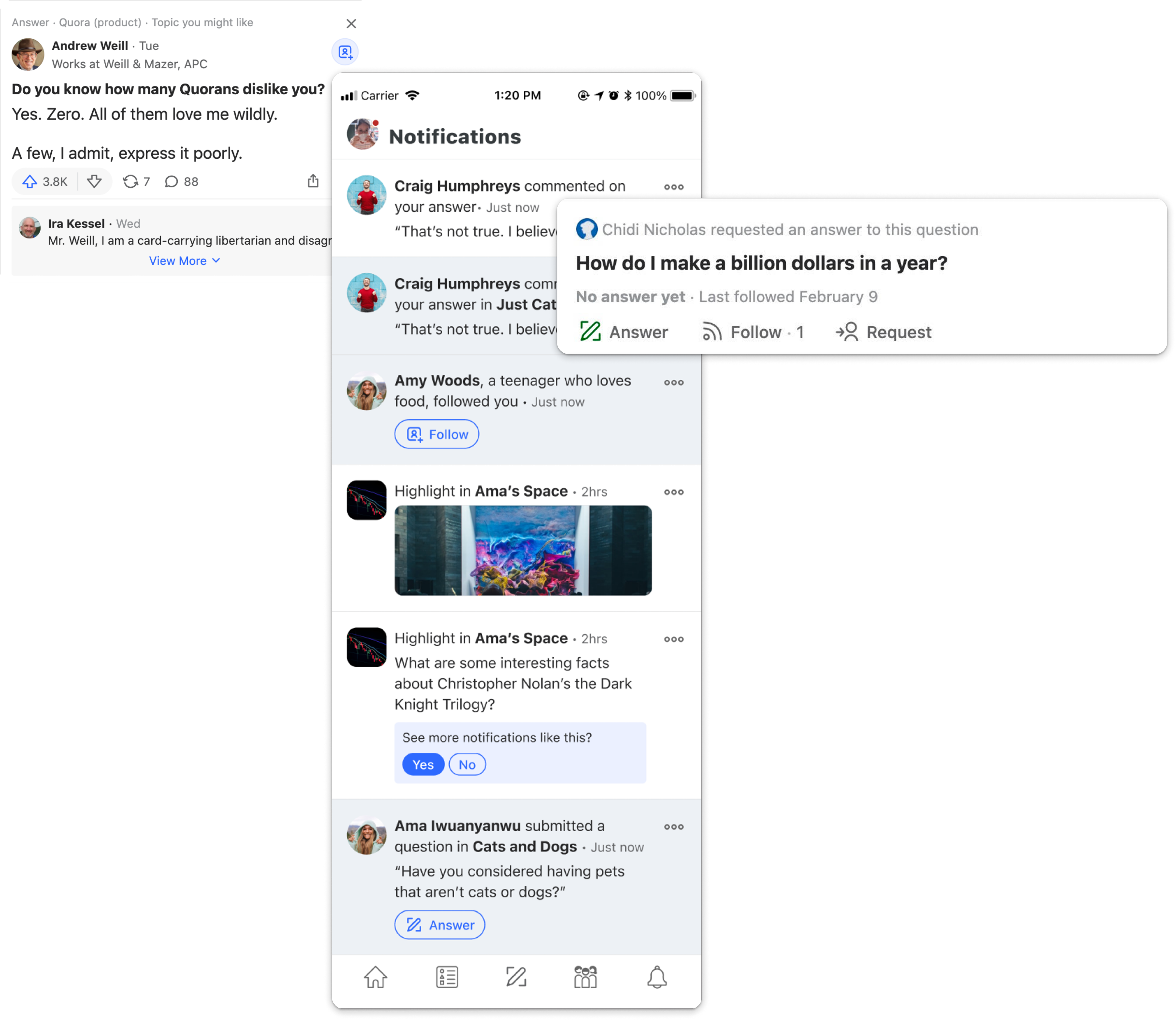
I made it easier for users to request answers to questions from spaces by making the request button easily accessible from a post.
I also added metadata to questions showing who was requesting answers which led to a 7% increase in questions answered.
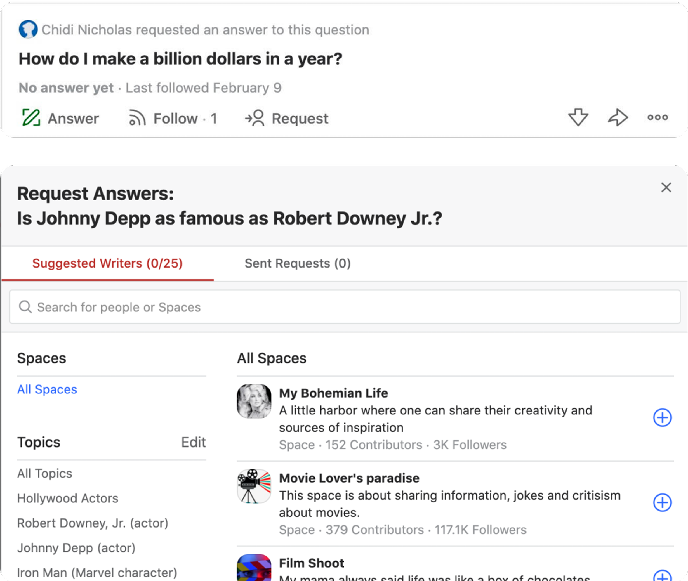
When a user clicks on the request button, the modal defaults to "All spaces" for selecting where to request an answer.
Short Content Friendly Feed
To improve the distribution of short posts, I designed and tested comment previews which encouraged engagement.
Short posts lacked visibility and engagement compared to longer posts. We also noticed that short posts did not have a clear CTA, unlike long posts, which have a 'read more' action that encourages users to engage.
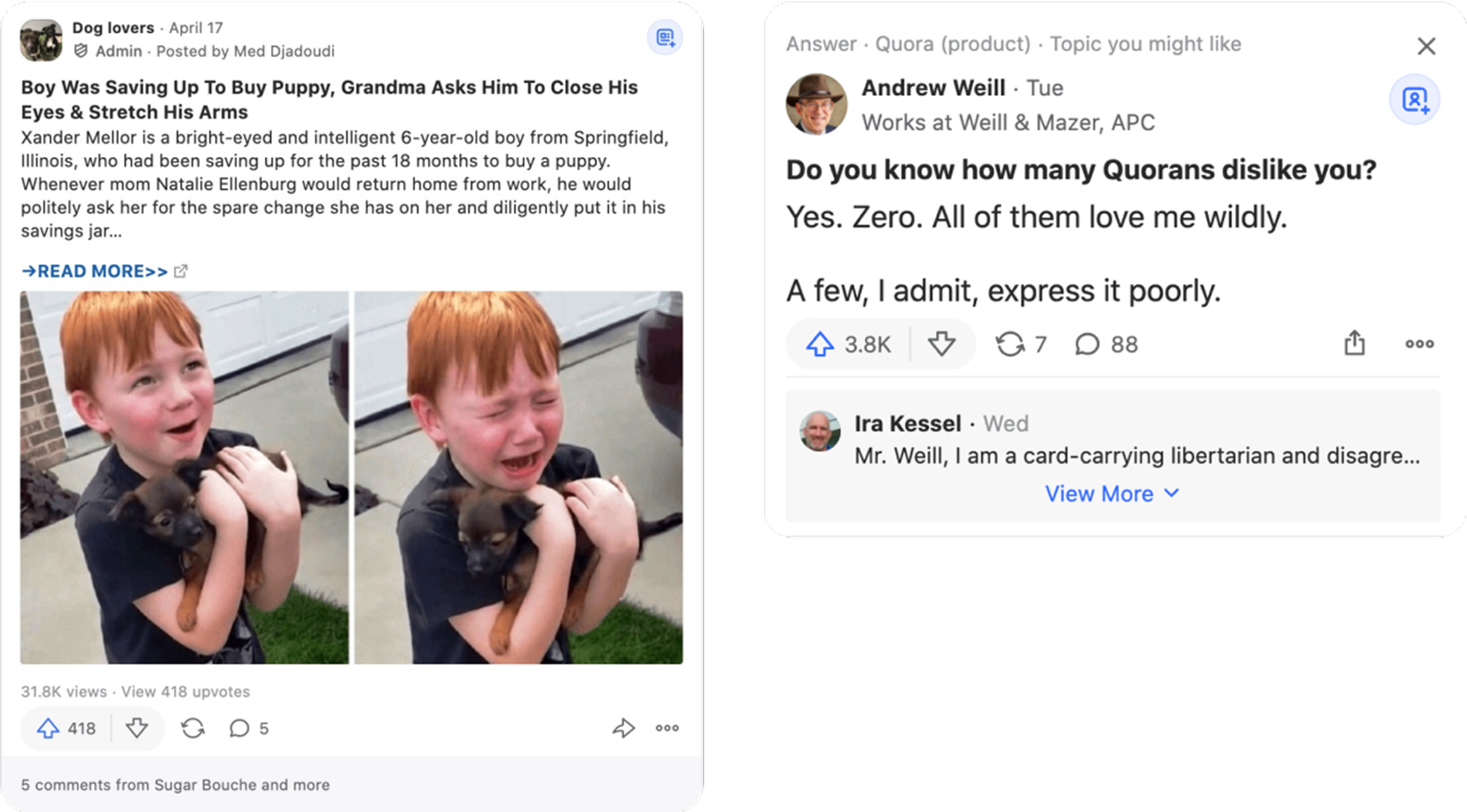
[Left] Long content displaying a "read more" CTA
[Right] New comment preview on short content
I designed and tested three variants of comment previews to prompt users to engage with short posts.
Although this change showed positive results in engagement, it negatively impacted other key metrics, and after multiple iterations, it was ultimately not launched.
A New Notification System
I identified usability issues in the notification system and designed solutions to improve clarity and scannability.
Notifications play a key role in user engagement on Quora. However, after auditing the in-app notification center, I found issues such as a lack of clear visual hierarchy, a poor clickthrough experience, and unsupported notification types (e.g., those with links and images) that weren’t properly addressed by the design system.
To address this, I categorized notifications and designed components that supported each type, ensuring the most important information stood out, to improve scannability.
For example, engagement notifications emphasized the user, while transactional notifications highlighted the content.
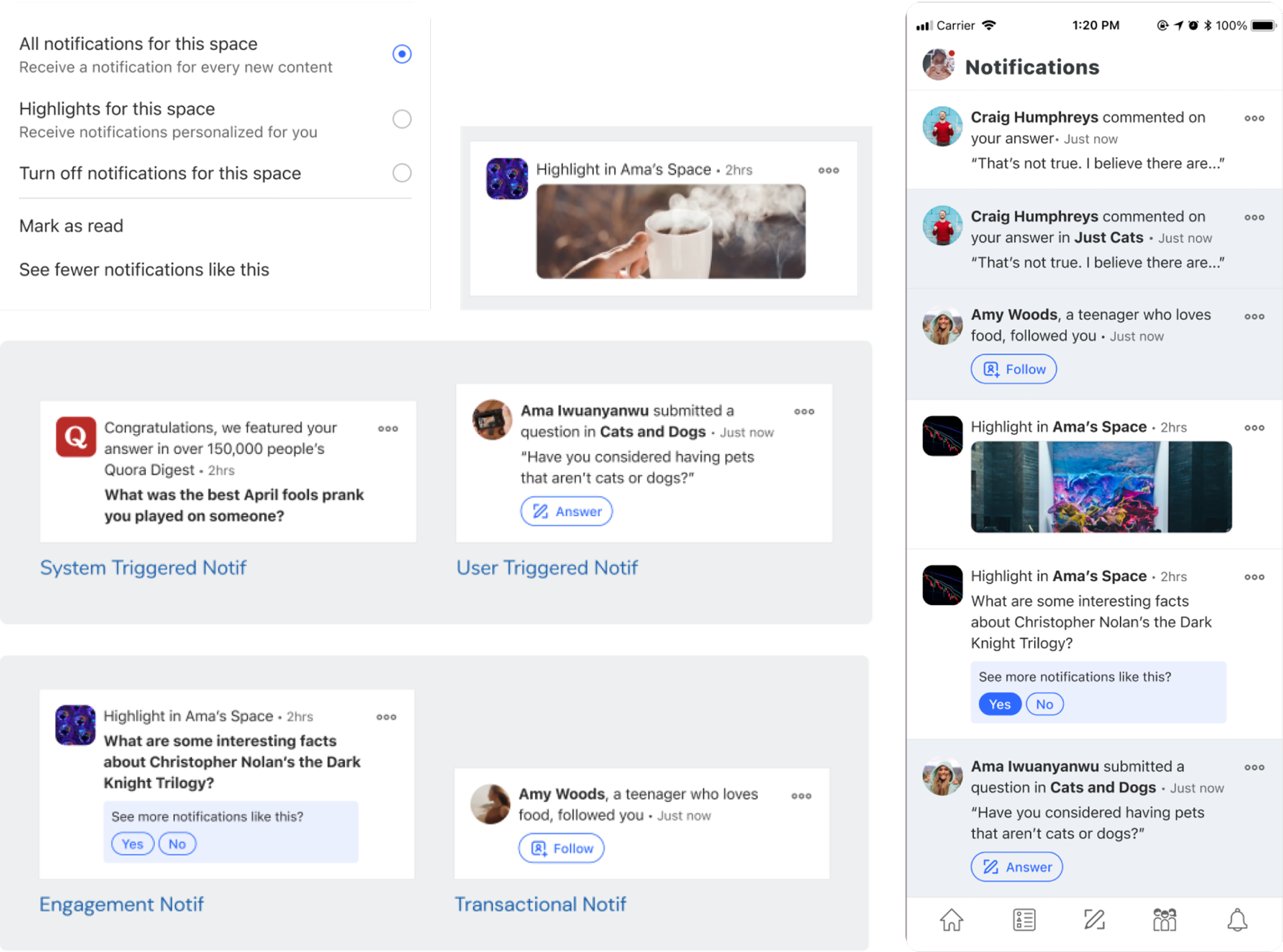
Some design changes I made to the Quora in app notification system
Impact
I launched impactful changes on a platform with 80M+ users, and gained hands on experience in a data-driven environment, seeing firsthand how design decisions influence user behavior.
Next ↓
Early warning for high risk individuals in healthcare facilities
Read